Advancement Project California, a racial justice non-profit, wanted to celebrate their 20th anniversary with a distinct mark that would complement their existing logo and brand identity. The design needed to let their California spirit shine while highlighting their invaluable community partners and avoid confusion with their DC counterpart or similar non-profits.
Graphic Design
Art Direction
Project Management
Copywriting
Social Media
Branding
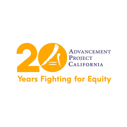
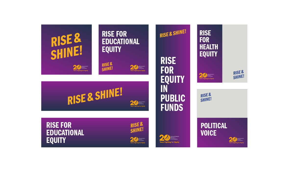
The 20th Anniversary Mark
A geometric '20' was added to house part of the existing logo and seamlessly transition the mark into the new lockup. The tagline followed suit, connecting the organization's successful history with its future ambitions.
Colors and Type

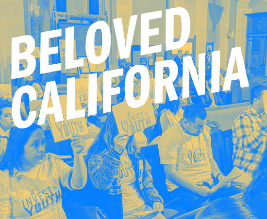
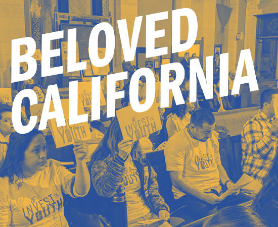
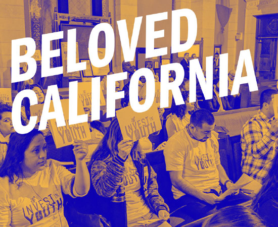
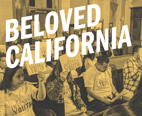
The Golden State
Joyful and breezy, that’s how the Golden State feels. Oranges and yellows display the vivid essence of California, while the blue, purple, and violets of sunsets enhance it. Combining these two color groups created a beautiful color palette.
To be Frank
Bold, honest, and reminiscent of social empowerment movements, Franklin Gothic was the chosen typeface for its boldness. An uppercase compressed version was used for headers.
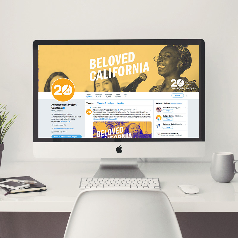
Fun with Web
We created general web, social, and email templates for the client to use as needed in the future.
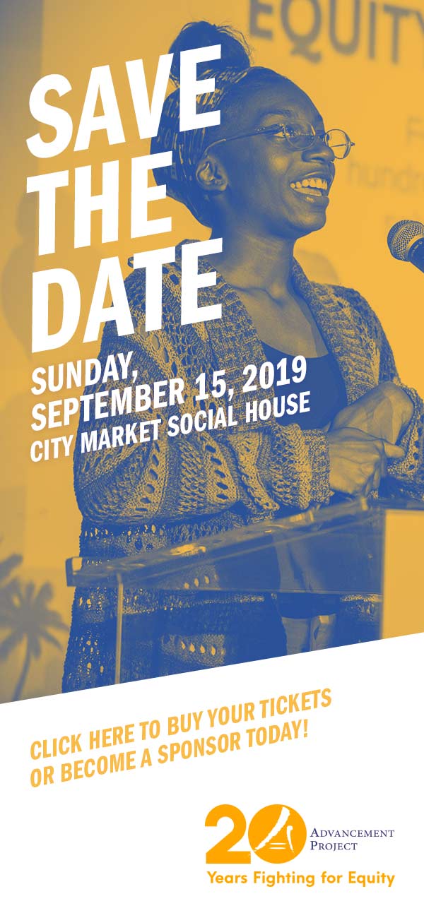
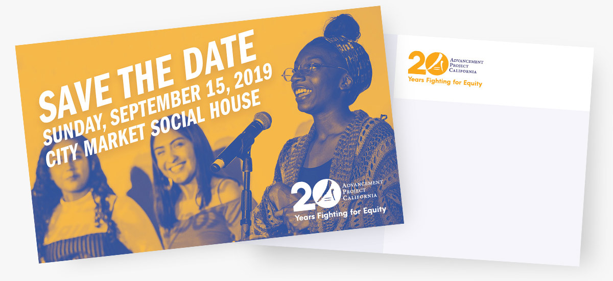
Postcard
This postcard served as a Save the Date reminder for an upcoming event.